- Published on
Building Kiosk Interfaces
- Authors
- Name
- Abi Raja
- Follow me on Twitter @_abi_


I recently built out the self-service ordering and pickup interface for Mezli, a robot restaurant in San Francisco that launched to critical acclaim in mid-August. (Check it out if you're in San Francisco! The food is delicious.)

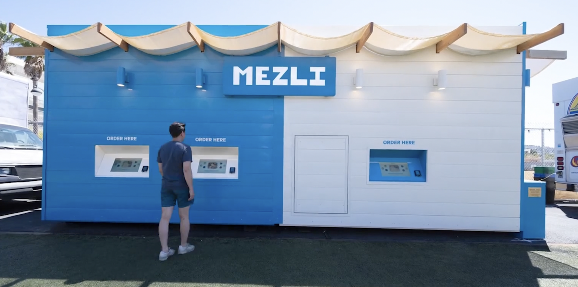
Their setup includes consumer touchscreens of various sizes. Above, you can see the ordering side with three 1920x1080 touchscreens. To the right, on the short end of the container, there are more screens: 2 large ones vertically mounted that show order names and statuses, and 2 smaller ones for pickup where you tap your name once your order is ready and the machine will serve you your food. These touchscreens/kiosks all run a locked down version of Chrome on Windows and so, the apps are standard React apps.
Designing for a touch screen brings with it a few interesting challenges compared to designing for web or mobile.
For one, because you only need to support 1 resolution and 1 size, it's much easier to build and test. You can hard-code pixel values, even though at this point, I'm trained not to do so from years of practicing responsive design and using CSS flex/grid. But the option to use pixel values when something is really hard to do responsively is great and saves a whole lot of time.
Here are some other differences:
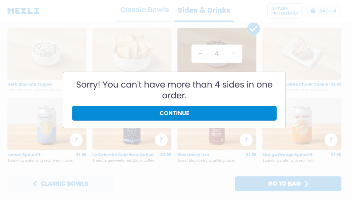
- Scrolling is ubiquitous on all our devices. On a kiosk, however, scrolling is a pain. The responsiveness of the touch screen isn’t great. The scrollbars aren’t super noticebale. So, we tried to avoid scrolling and instead have distinct pagefuls of content with Next/Previous buttons to navigate.
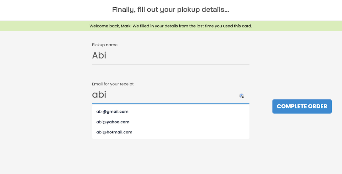
- Typing is not fun on a kiosk. We added a number of affordances such as autocomplete for email domains. But eventually we ended up making email optional because users hated typing on the screen keyboard so much. Ideally, we'd have an account system where you can sign up with your phone and when you show up at the Kiosk, you just scan a QR Code to associate this order with your account and all your details.

- The relatively low resolution – 1080p – given the large physical size of the screens means you don't want elements and font sizes to be too big. The user is very close to the screen, much closer than they are to an external monitor. Text is also to hard to read if it spans the full width of the screen. Popups are set to have a max-width so long lines of text wrap and are easier to read.

- We also run into lots of touch sensitivity issues. These would likely be solved by using better touchscreens - I never have issues with touches on an iPad. But once the container was built, it was hard to swap these touchscreens out. We mitigated some of these touch issues in browserland. For example, long press on Windows registers as a right click and opens up the context menu. Overriding the default for the contextmenu event can turn long presses into regular touches, providing a better user experience.
Building interfaces for a single, fixed resolution is simpler and fun, but like any new device and setting, there are quirks and challenges that can only be addressed by testing on the device itself and understanding its limitations as well as advantages.